BAIT AND SWITCH
Art Direction . Branding / Logo Design . UI . UX
BAIT AND SWITCH
Art Direction . Branding / Logo Design . UI . UX


ARIO TECH
UI . UX . Brand Strategy . Art Direction . Website Development
Ario is a digital tool designed to use augmented reality and an intuitive resource repository user interface to help industrial workers with the instructional and diagnostic hurdles faced in the workplace. As an acquisition through The Bolden Group, naturally our clientele shifted to cater to the United States Air Force and Navy.
The platform is comprised of two derivative services, Ario Pre-Flight and Ario Connect (logo variations shown above):
Ario Pre-Flight is intended to play the role of an autonomous digital instructor for students and mechanics while performing maintenance and/or diagnostics checks on military aircraft. The platform provides a sequential walkthrough of an aircraft (or any piece of equipment) by identifying granular components and providing access to a deep library of pertinent information. This was our "flagship" product and what is being showcased in the user flow demonstrations further down.
Ario Connect still leverages the lidar scanning technology however, is more geared towards enabling remote communication in real-time between industrial workers on-site. Say a piece of equipment on an aircraft carrier or oil refinery is malfunctioning but the technician/expert is not present... the technician can guide the worker through what to do via the Ario Connect platform while referencing critical visuals and other information in order to resolve the issue.

USER FLOW 1 - ENGINE WALKTHROUGH
This prototype was created in Figma and demonstrates the initial user flow from right after a user logs in. From there they choose the aircraft and type of profile (student or instructor). Instructors have a much more extensive scope of features allowing them to edit, add and rearrange media that integrates with the curriculum.
The sequence shows the user being guided toward the engine turbine where the device's camera recognizes the various PIPs (Placed Information Points) correlating with the granular components of the categorical piece of equipment (the engine). Selecting a PIP prompts a series of dialogue boxes that provides informative media aiding in the mainenance, diagnostics or repair of the equipment.
USER FLOW 2 - NOSE GEAR WALKTHROUGH
The previous prototype included a bit more navigational features in the form of panels and steps in the sequence. This Nose Gear User Flow is a little more trimmed down from a UI perspective to accommodate the simplified "proof of concept" deliverable.
You will see that more of the curriculum takes place on the intro screen showing the overview schematic of the plane. The user is provided with access to the media library and notes directly from selecting the particular numbers, which correlate with the eqipment categories.
As with any product or service in this day and age we needed a sufficient website to present our concept and provide a way for early adopters to sign up. Perhaps the most important function of the site was to accurately and concisely relay what and how the platform(s) worked via uber simple illustration-driven narratives. The overall tactic behind convincing our audience was addressing pain point across industries and reveal how the products of Ario could help through these visuals.
The foundation of the brand was established before we became involved and was meant to be inviting, clean, bold and a little playful as it was a ubiquitous product for all industries and people. The mantra is enabling ALL workers to seamlessly become experts. My intent was to juxtapose the monochromatic, hyper-simple 3D rendered images/settings with depictions of the actual application to convey instant, intuitive relatability to something that may seem almost intangible at first.

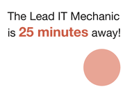
Below we have an example of a narrative demonstrating that paint point > solution sequence of Ario Connect. The isometric, monochromatic off-white rendering of the industrial compound is meant to feel a bit overwhelming with its scale and complexity along with the red accents. Strategically, the "solution" is ushered in along with the mockups and bullet points that relay what utility/value the platform provides.

Once the proof of concept for each platform application was built out and all supporting digital material was complete, it was time to pitch our product to the designated audience. The primary demographic was the United States Military. Below is one of many technical presentation decks that I was responsible for designing. These had to be very pragmatically composed to relay exactly what we had to offer and why they needed it in the most concise manner possible following the path of least resistance. These guys have very important things to do.


